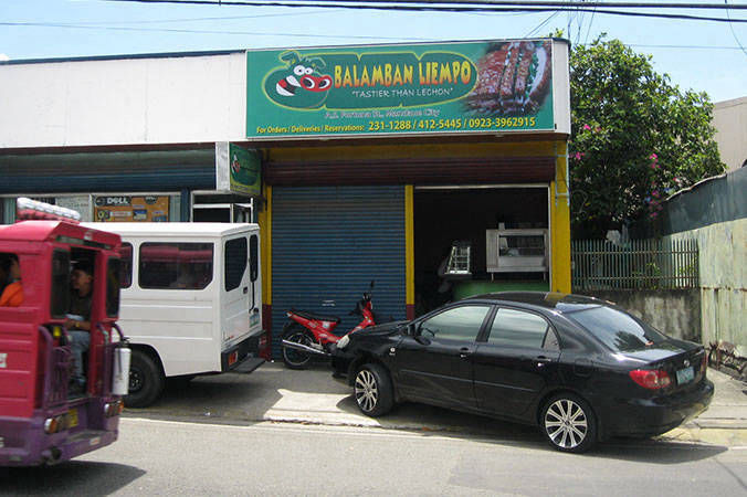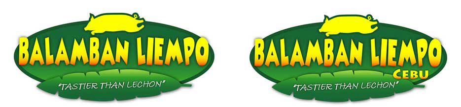
Final company logo, for Cebu (left) and outside Cebu province (right)
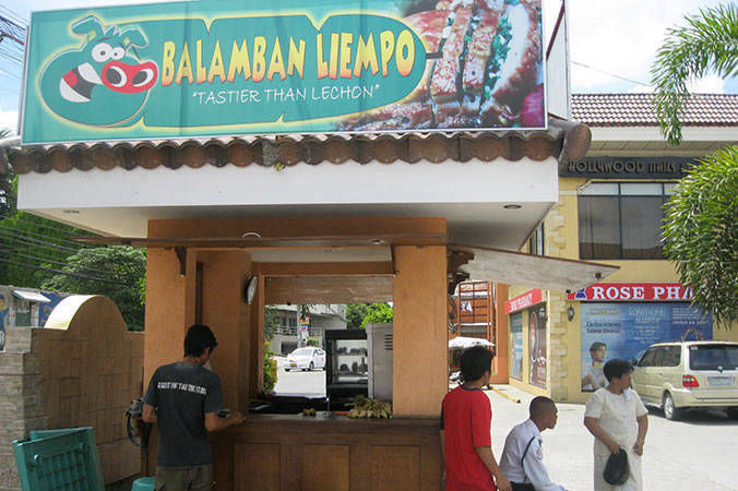
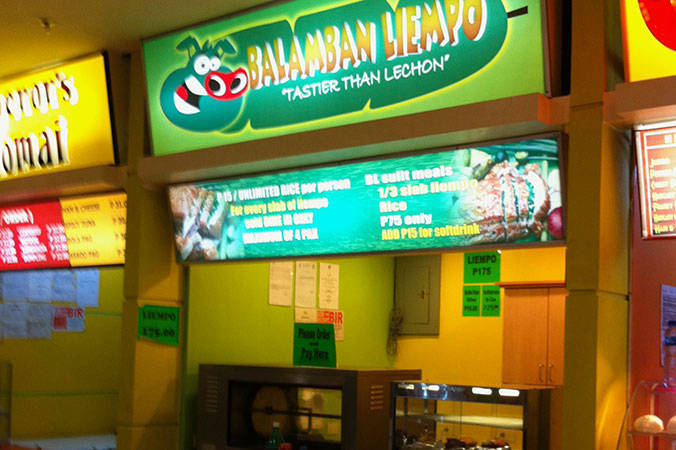
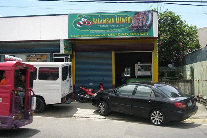
Today, this is the official company logo. The main drivers for the change and final design were:
1. A simple and easily recognized format
2. Brand name, with font colors giving a hint of slow cooking
3. Leaf design to emphasize freshness and taste
4. Concept of ‘Tastier Than Lechon’ via words and product shot