
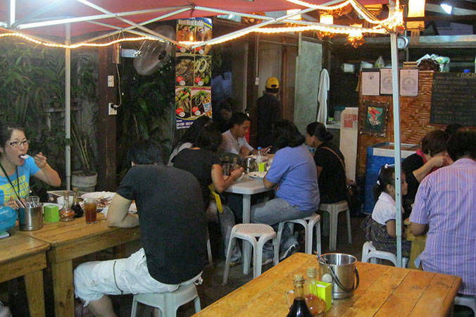
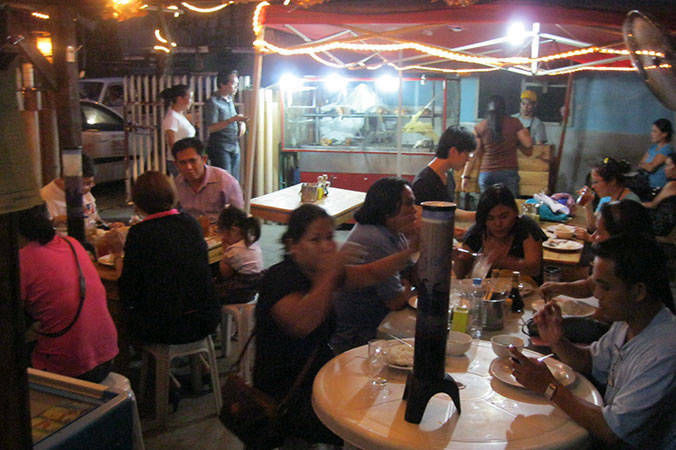


The pioneer branch, located in Tres Borces St., Mabolo, Cebu City
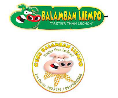
Initial concepts and designs of the company logo
Today, this is the official company logo. The main drivers for the change and final design were:
1. A simple and easily recognized format
2. Brand name, with font colors giving a hint of slow cooking
3. Leaf design to emphasize freshness and taste
4. Concept of ‘Tastier Than Lechon’ via words and product shot

Final company logo, for Cebu (left) and outside Cebu province (right)
